From Brochure to Booking: Boost Website Conversions
Is your website just a digital brochure? Learn the key reasons sites fail to convert and get actionable strategies to turn yours into a lead-generating machine.
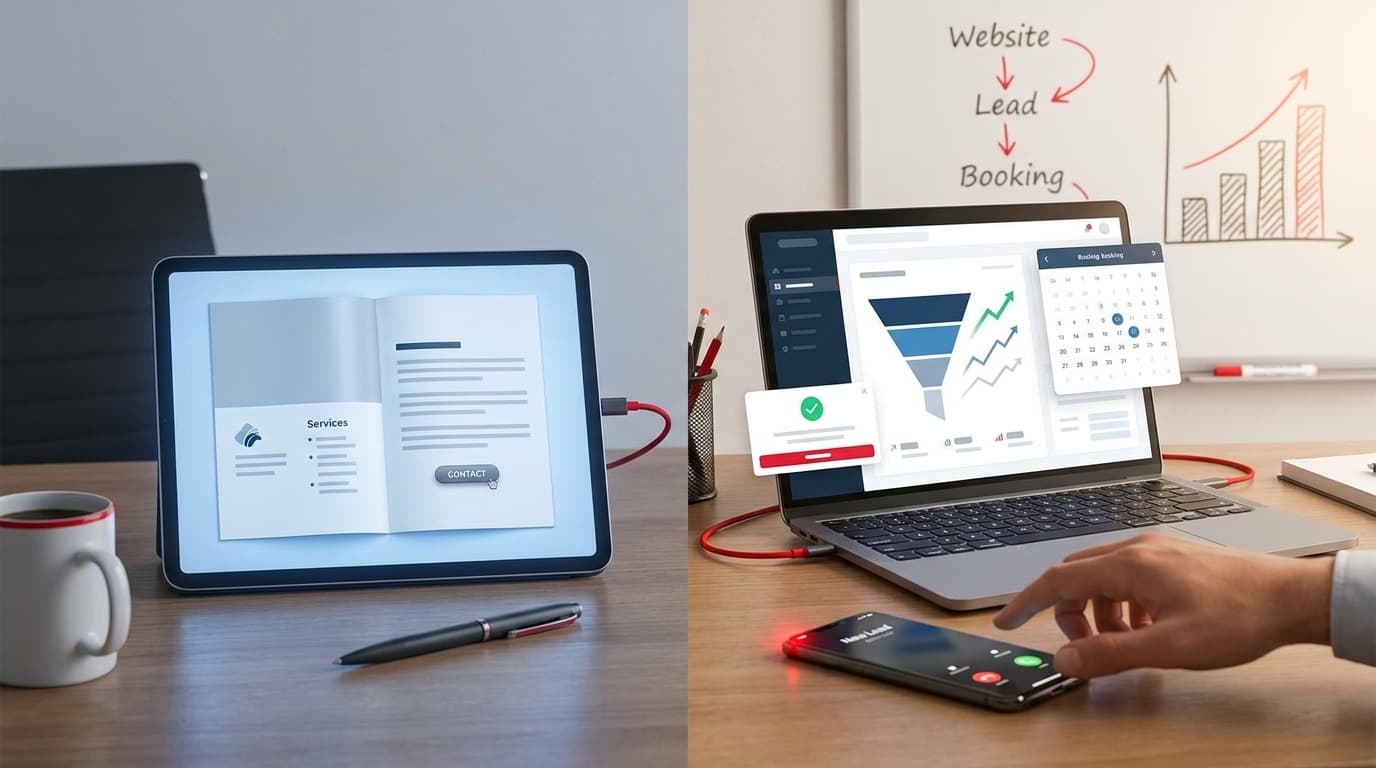
You’ve invested time, money, and energy into creating a beautiful website for your business. It has your logo, your services are listed, and the contact page works. So why isn't the phone ringing? Why are contact form submissions so rare?
If this sounds familiar, you’re not alone. Many businesses fall into the trap of creating a “digital brochure”—a website that looks nice and provides information but does little to actively generate leads or sales. It exists, but it doesn't perform.
A successful business website isn’t a passive document; it's your hardest-working salesperson, operating 24/7. It should guide visitors, build trust, and actively persuade them to take the next step. In this post, we'll diagnose the most common reasons your website isn't converting and give you actionable strategies to fix it.
The "Digital Brochure" Problem
A digital brochure website is static. It presents information and waits for the visitor to be motivated enough to take action. It assumes that if someone needs your services, they'll figure out how to get in touch. This is a critical mistake.
A high-converting website, on the other hand, is a dynamic tool. It anticipates the user's needs, answers their questions before they ask, and makes the path to becoming a customer incredibly simple and inviting. Every element, from the headline to the button color, is designed with a single goal in mind: conversion.
Leaving your website in a passive state is costly. You lose potential customers, your marketing dollars are less effective, and your competitors with more strategic sites are capturing the leads you’re missing.
5 Common Conversion Killers (And How to Fix Them)
Let’s break down the most frequent issues that hold websites back and explore how you can address them.
1. Unclear Value Proposition & Messaging
When a potential customer lands on your homepage, they should be able to answer three questions within five seconds:
- What do you do?
- Who do you do it for?
- What makes you the best choice?
The Problem: Many websites are filled with industry jargon, vague marketing speak ("synergistic solutions"), or feature-focused language that doesn't resonate with the customer's actual problems. If a visitor is confused, they will leave.
The Fix:
- Craft a Crystal-Clear Headline: Your main headline, placed prominently "above the fold" (the part of the page visible without scrolling), should state the primary benefit you offer. Instead of "Innovative Tech Services," try "We Automate Your CRM So You Can Close More Deals."
- Focus on Benefits, Not Just Features: A feature is what your product does; a benefit is what the customer gets. Don't just say you offer "AI-powered analytics." Say, "Get AI-powered insights to cut your marketing spend by 30%."
- Use Your Customer's Language: Pay attention to how your ideal clients describe their pain points and goals. Use that language in your copy to build an instant connection.
2. A Confusing User Journey
A visitor has arrived on your site with a goal in mind. Your job is to make achieving that goal as easy as possible. A confusing journey creates friction and frustration, causing them to abandon the site.
The Problem: The navigation is a maze, there are too many competing calls-to-action (CTAs), and there's no obvious next step. The visitor doesn't know where to click, so they don't click anywhere.
The Fix:
- Define One Primary Goal Per Page: What is the single most important action you want a user to take on this page? For a service page, it might be "Request a Quote." For a blog post, it might be "Download the Guide." Make that primary CTA prominent.
- Use Strong, Action-Oriented CTAs: Vague buttons like "Learn More" or "Submit" are weak. Use compelling, specific language like "Get My Free Proposal," "Book a 15-Minute Demo," or "Start My Project."
- Simplify Your Navigation: Your main navigation menu should be clean and intuitive. Limit it to the most essential pages. Guide your user logically from learning about your service to making a purchase or inquiry.
3. Lack of Trust and Social Proof
People do business with companies they know, like, and trust. In the digital world, where you can't offer a firm handshake, your website has to do all the work of building that credibility.
The Problem: The website looks unprofessional, has no testimonials or case studies, and offers no signals that you are a legitimate, trustworthy authority in your field.
The Fix:
- Showcase Social Proof: Display testimonials from happy clients, preferably with their full name, company, and photo. Feature logos of well-known companies you've worked with. In-depth case studies with measurable results are even more powerful.
- Display Trust Badges: Include security seals (if you process payments), industry awards, certifications, or guarantees. These small visual cues can significantly reduce visitor anxiety.
- Invest in Professional Design: An outdated or poorly designed website signals a lack of care and professionalism. A clean, modern, and error-free design is a fundamental trust signal.
4. Ignoring the Mobile Experience
More than half of all web traffic comes from mobile devices. If your website is difficult to use on a smartphone, you are alienating the majority of your potential audience.
The Problem: Text is too small to read, buttons are hard to tap, pages load slowly on a mobile connection, and users have to pinch and zoom constantly.
The Fix:
- Embrace Responsive Design: Your website should automatically adapt its layout to fit any screen size, from a large desktop monitor to a small smartphone. This is non-negotiable in today's market.
- Optimize for Speed: Mobile users are impatient. Compress images, streamline code, and leverage browser caching to ensure your pages load in three seconds or less.
- Simplify Mobile Navigation: Use a clear "hamburger" menu and ensure that forms and other interactive elements are easy to use with a thumb.
5. Friction in the Conversion Process
You've done everything right. The user is convinced and clicks "Book an Appointment." But then they're faced with a 15-field form or a clunky, confusing calendar tool. This is where conversions go to die.
The Problem: The final step to becoming a lead is too long, complicated, or intimidating.
The Fix:
- Simplify Your Forms: Only ask for the absolute minimum information you need to take the next step. You can always gather more details later. For an initial contact, a name, email, and a message box are often enough.
- Use a Seamless Booking Tool: Integrate a modern, user-friendly appointment scheduler that syncs with your calendar. Make it effortless for a lead to find a time that works for them.
- Test the Process Yourself: Go through your own conversion process from start to finish on both desktop and mobile. Is it fast? Is it easy? Is every step perfectly clear? Fix anything that feels even slightly awkward.
From Information to Action
Transforming your website from a digital brochure into a conversion machine is about a shift in mindset. Stop thinking of your site as a static repository of information and start treating it as an active participant in your sales process.
By clarifying your message, guiding the user journey, building trust, optimizing for all devices, and removing friction, you create an online experience that doesn't just attract visitors—it turns them into valuable customers.
Ready to stop leaving money on the table? It's time to put your website to work. If you're unsure where to start, the team at Gray Tech Solutions can help. We specialize in designing and developing websites that don't just look good—they deliver results.
Contact us today for a free website conversion audit and let's turn your digital brochure into a booking powerhouse.